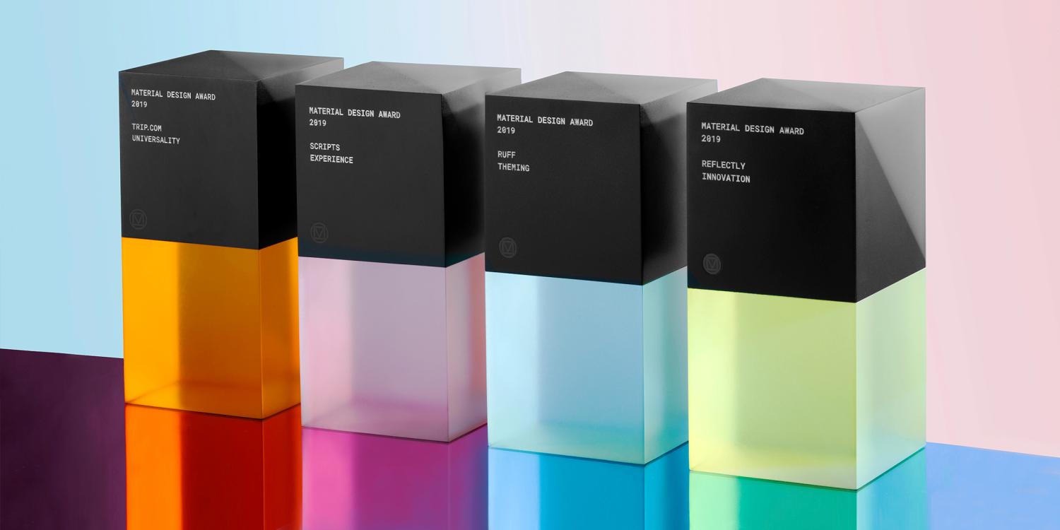
Material Design Awards 2019: Das sind die besten Android-Apps aus Sicht der Google-Designer (Galerie)

Das Material Design sowie die Erweiterung Material Theme sind für Google sehr wichtige Grundlagen zur Vereinheitlichung aller Oberflächen über alle Plattformen hinweg. Googles Design-Grundlagen werden aber nicht nur im eigenen Unternehmen eingesetzt, sondern von vielen anderen App-Entwicklern beachtet und entsprechend umgesetzt. Bereits seit dem Jahr 2015 gibt es die Material Design Awards die auch in diesem Jahr wieder vergeben worden sind. Wir zeigen euch die vier Gewinner-Apps.
Google hat das Material Design sowohl zur Vereinheitlichung der eigenen Oberflächen als auch zur Modernisierung und für plattformübergreifendes Design eingeführt. Das Design ist relativ zeitlos gehalten und dürfte auch in vielen Jahren noch modern und nicht altbacken wirken. Das liegt auch daran, dass das Design lebt und immer wieder leicht angepasst wird – aktuell besticht es vor allem durch wenige Farben und schwächere Konturen, beachtet aber weiterhin alle Grundlagen der ersten Version.
Google vs. Apple: Google treibt Downloads im Play Store in die Höhe & Apple verdient das große Geld
Google hat die Material Design Awards in diesem Jahr wieder in vier Kategorien vergeben, die sich vor allem darum drehen, das stark adaptierbare Design an die eigenen Bedürfnisse anzupassen und dennoch die gewohnten Elemente beizubehalten. In diesem Jahr sind die Gewinner zwar nicht wirklich kreativ geworden und wären ohne Googles Award inklusive Beschreibung wohl kaum aufgefallen, aber das zu bewerten oblag ja glücklicherweise der Jury.
Vergeben wurden die Awards in folgenden Kategorien
- Expression: An expressive brand identity executed with Material Theming, including the consistent application of color, typography, and shape.
- Innovation: A demonstrated ability to build upon and extend the Material Design system in inspiring new directions.
- Universality: A thoughtful and inclusive design tailored to the specific needs of users with a range of abilities and user needs.
- Experience: A creative and effective deployment of interaction, navigation, and content in service of an impactful user experience.
Die Gewinner
Theming: Ruff
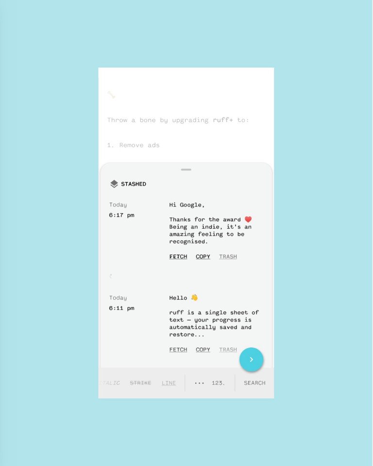
Ruff’s straightforward brand identity empowers the app’s note-taking users to quickly capture their thoughts in any style. Ruff makes great use of Material Components, especially the bottom sheet and backdrop (which serves as the app’s primary canvas). The blue floating action button and monospaced font add visual interest while taking a refined approach to theming. While the slightly rounded corners of the bottom sheet help communicate the component’s gestural behavior and let the user know that they can drag up for more content. The UI also allows for simple customization of type size and the choice of a light, dark, or black theme. Prioritizing function and clarity, Ruff’s consistent use of typography, shape, and color create an inviting themed experience.
Innovation: Reflectly
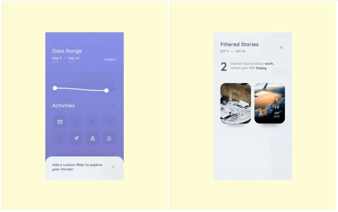
Reflectly helps people manage stress and anxiety through the practice of daily journaling with prompts from a conversational, AI-powered UI. The app’s skillful onboarding experience applies smooth transitions and playful language to guide new users through setup. Besides the warm, approachable tone of its questions, Reflectly’s interface is full of artfully executed motion choreography (the way UI elements appear on screen, for instance), elevation adjustments (like raising the level of items in a carousel), and state changes that add up to a well-crafted user experience. The use of customized components, typography, shape, and elevation build on the principles of Material Design while creating a unique product that’s recognizable, usable, and an all-around joy.
Experience: Scripts
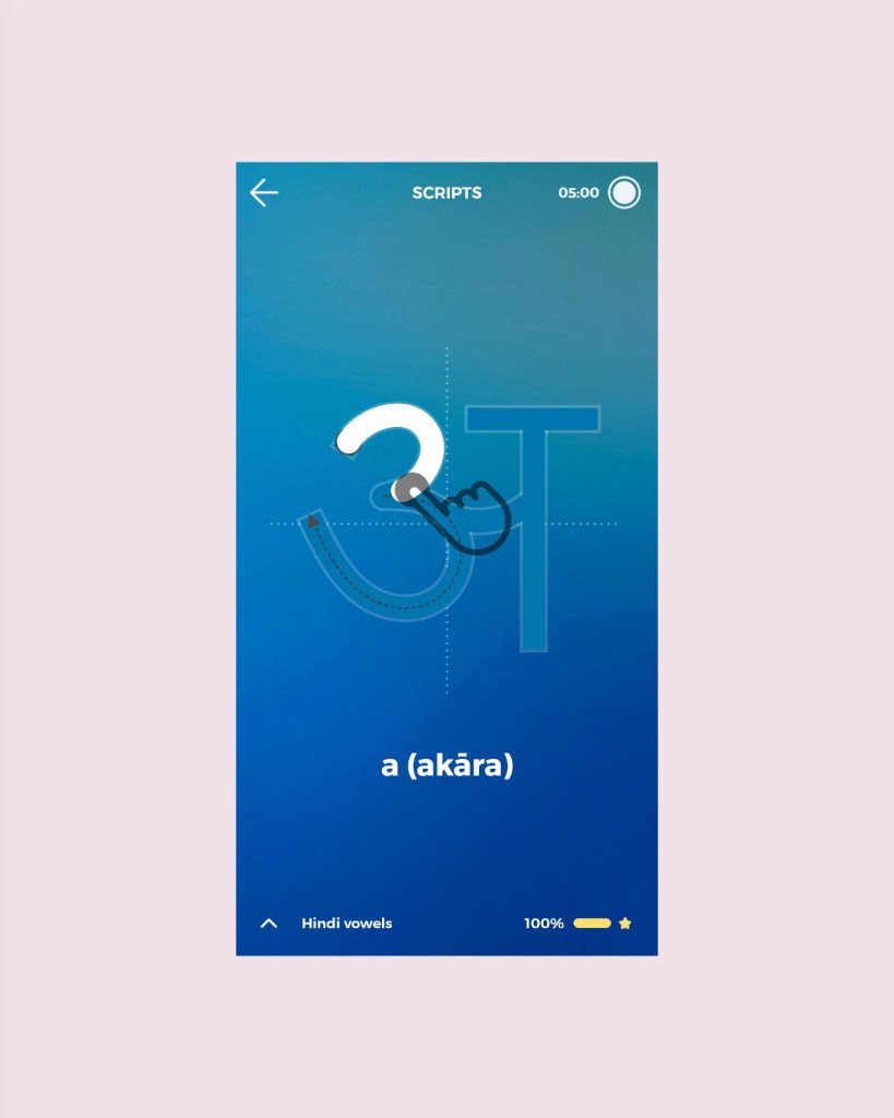
Scripts presents an ingenious solution to the challenge of learning new writing systems, through its clever use of touchscreen capabilities. The app’s step-by-step drawing interaction presents clear instructions—including stroke order—alongside small animations and haptic feedback, to deftly reinforce the correct technique. Small details like the well-designed system of gradients, consistent typography, and even the little bump indicating state in the bottom navigation bar combine to deliver a polished user experience. For some languages, Scripts incorporates background images as visual mnemonics, thoughtfully connecting a character’s form to the object it represents. Overall, the experience demonstrates a considered approach that naturally engages the user in active learning.
Universality: Trip.com
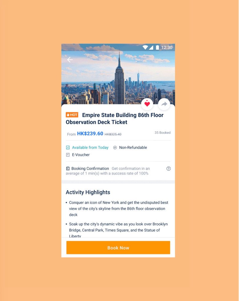
Trip.com created an excellent travel-booking experience for its global audience. The app’s layout and typographic scale construct a strong visual hierarchy that holds up across an impressive 19 supported languages. Cohesive iconography and playful colors (which all meet accessible contrast requirements) reinforce key actions and draw attention to important information. The bottom navigation provides multiple visual cues to display active destinations—icons transform from outline to fill, text labels increase in size, colors change. The imagery and illustrations reflect Trip.com’s diverse user base, just one of the many thoughtful details that make this an excellent universal app.
» Ankündigung im Google Design-Blog
Google vs. Apple: Google treibt Downloads im Play Store in die Höhe & Apple verdient das große Geld
GoogleWatchBlog bei Google News abonnieren | GWB-Newsletter
Teile diesen Artikel: