Material Design Awards 2018: Das sind aus Googles Sicht die besten Android App-Designs

Mit dem Material Design hat Google eine plattformübergreifende Design-Sprache eingeführt, die schon von Anfang an über die eigenen Grenzen hinaus ging und auch von vielen anderen Entwicklern und Designern verwendet wurde. Um diese Mühen zu belohnen hat Google im Jahr 2015 die Material Design Awards ins Leben gerufen, die vor wenigen Stunden nun schon zum vierten mal vergeben worden sind. Hier seht ihr die Gewinner.
Google hat das Material Design sowohl zur Vereinheitlichung der eigenen Oberflächen als auch zur Modernisierung und für plattformübergreifendes Design eingeführt. Das Design ist relativ zeitlos gehalten und dürfte auch in vielen Jahren noch zeitgemäß und modern sein. Dennoch wurde es in diesem Jahr aktualisiert und besticht nun zusätzlich durch weniger Farben, weniger Rahmen und insgesamt schwacheren Konturen. Aber das heißt natürlich nicht, dass das jeder Designer nachmachen muss – und das tun sie glücklicherweise auch nicht.
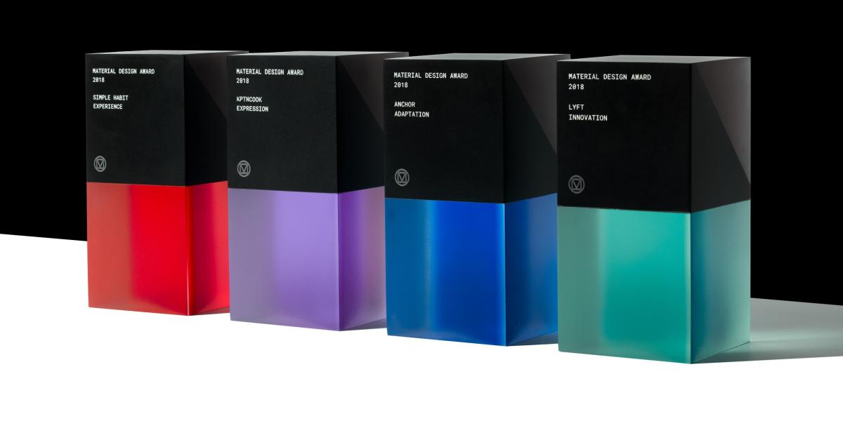
Google hat die Material Design Awards in diesem Jahr wieder in vier Kategorien vergeben, die sich vor allem darum drehen, das stark adaptierbare Design an die eigenen Bedürfnisse anzupassen und dennoch die gewohnten Elemente beizubehalten. In diesem Jahr sind die Gewinner zwar nicht wirklich kreativ geworden und wären ohne Googles Award inklusive Beschreibung kaum aufgefallen, aber das zu bewerten oblag ja glücklicherweise der Jury.
Vergeben wurden die Awards in folgenden Kategorien
- Expression: Brand identity brought to life through the engaging and harmonious use of color, imagery, typography, and motion.
- Innovation: Demonstrated ability to build upon and extend the Material Design system in inspiring new directions.
- Experience: Creative and effective deployment of interaction, navigation, and content in service of an impactful user experience.
- Adaptation: Cross-platform design that delivers a consistent experience, with native features and functionality optimized for each device.
Die Gewinner
Expression: KptnCook
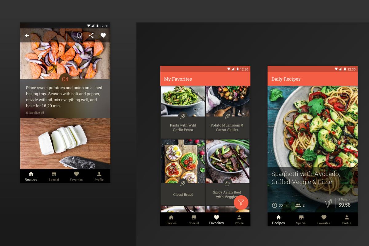
KptnCook’s intimidation-free approach to cooking extends through the app’s engaging, hassle-free design. Step-by-step instructions with images of ingredients and techniques lead users through the cooking process; these detail pages feature a transparent top app bar that references similar touches within the app. The Favorites view features a scannable image list of saved recipes, with branded iconography and type, plus a custom shape for text protection. All these details work with the app’s immersive, full-screen imagery to showcase beautifully executed meals.
“We strongly believe that anyone can cook. Our mission is to simplify the daily dinner decision—and avoid endless scrolling—by giving our users a selection of three recipes each day. Our visual language is clean, simple, and rather subtle.”
Innovation: Lyft
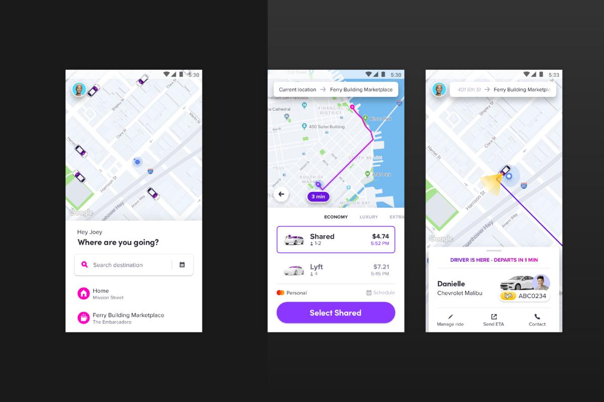
Lyft recently revamped its app, rethinking fundamental aspects of the backend UX while also adopting and adapting Material Components in impressive and unexpected ways. Bottom sheets and an extended Floating Action Button (FAB) optimize available screen space throughout, while custom color system algorithms ensure accessibility and legibility of their iconic neon-bright hues. Using their own take on Material, Lyft has seamlessly realized a singular brand expression.
“One of our biggest priorities was to create a universal design system that works best for Lyft on all platforms.”
Experience: Simple Habit Meditation
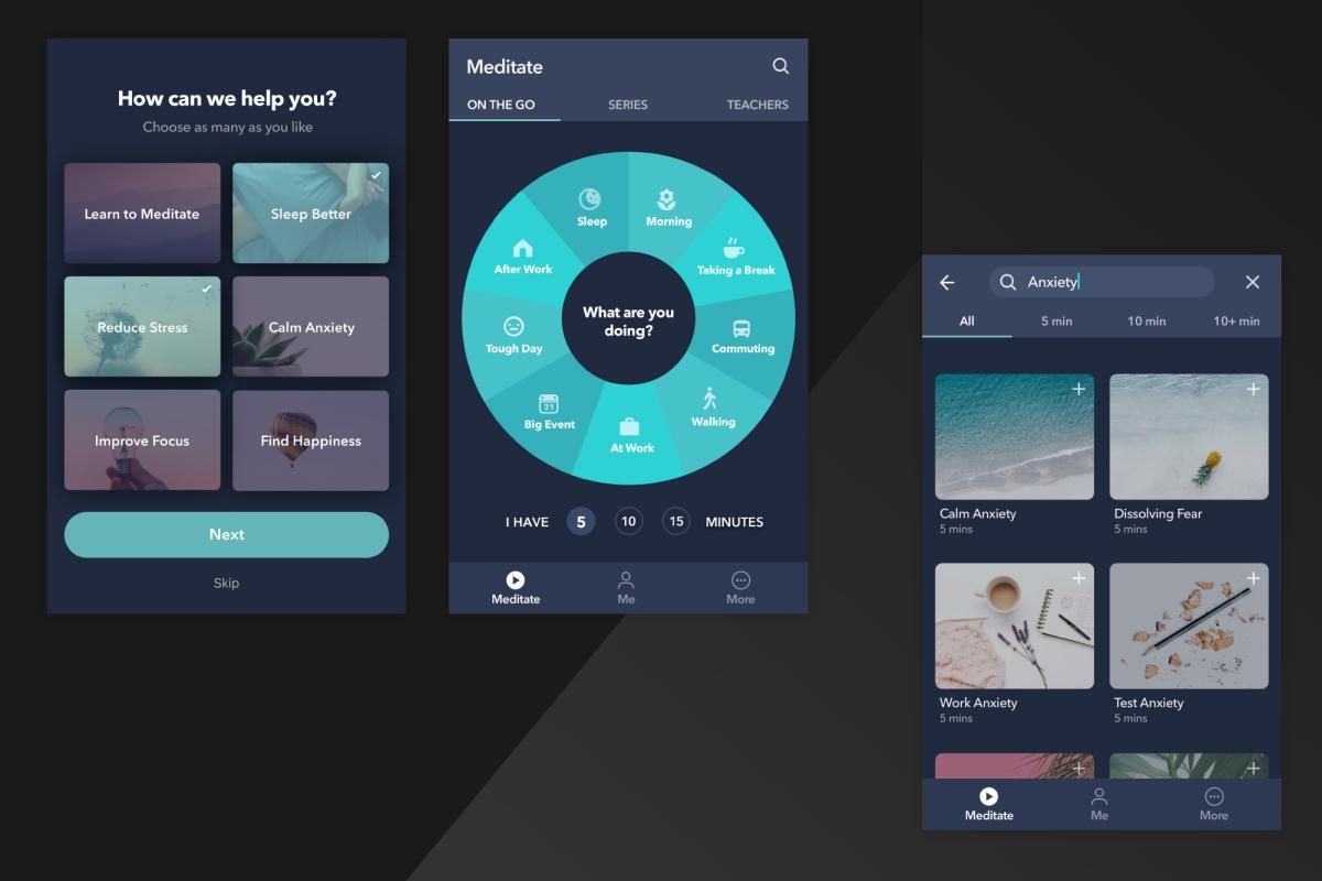
Learning how to slow down and de-stress requires an equally tranquil interface; from first tap, Simple Habit Meditation opens up with an easy onboarding experience—which employs color-coded, selectable image cards to support the calming, purposeful navigation. It uses a dark theme effectively, with cool implementation of cards and bottom navigation, branded typography, and subtle motion cues across mobile devices and tablets.
“The app’s simple information architecture and intuitive navigation allow users to quickly and easily discover the right meditation for their particular situation. Positive user actions, such as ‚‘meditation completes,’ are reinforced with rewarding interactions that help people build their positive habit more rapidly, while leaving them delighted by the experience.”
Adaptation: Anchor
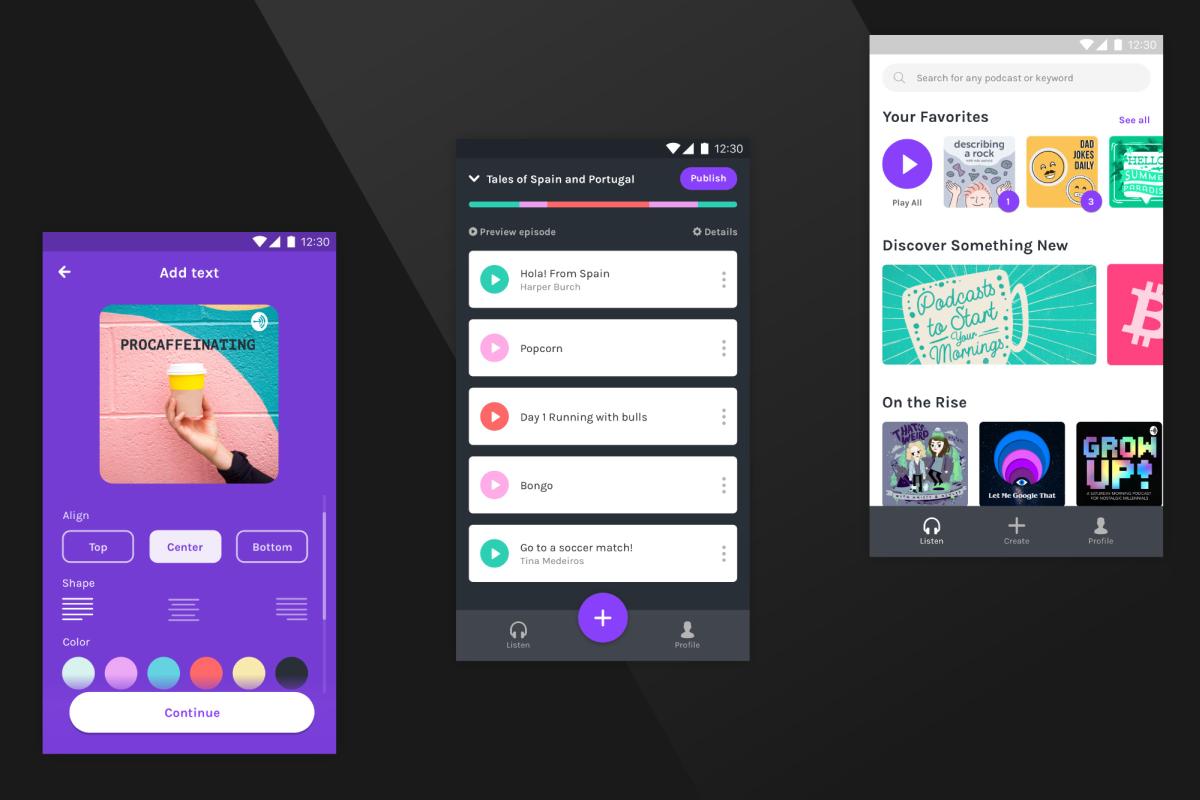
Anchor’s DIY podcast tool is impressively buttoned-up, with a seamless flow across platforms and devices. Android and iOS users can record from their phones and find the audio automatically uploaded to the web app. Choice chips clearly delineate and display options for the alignment selection in edit mode, where an extended FAB is anchored to the bottom to allow the action to remain persistent. Nice animations complement this solid cross-functional solution for aspiring broadcasters.
“Anchor uses bright colors, friendly typography, and conversational copy to make sure podcasting is approachable for anyone, even people who’ve never done it before. We use animations and transitions to make our app feel lively, responsive, and fluid.”
» Ankündigung im Google Design-Blog
GoogleWatchBlog bei Google News abonnieren | GWB-Newsletter
Teile diesen Artikel: